Perrone's Barber Shoppe Logo Design
Client: Perrone’s Barber Shoppe
Industry: Cosmetology
Year: 2021
Type of Project: Logo design only
About This Project: My first professional logo design, this one brings me back.
After talking with one of the barbers about myself and what I did for work, he asked me if I could design Perrone’s a new logo. At the time, designing for specific businesses, like barber shops, was new territory for me, so I had to do my research to get what the feel of a classic barber shoppe in business in the modern day would look like (at least in my mind).
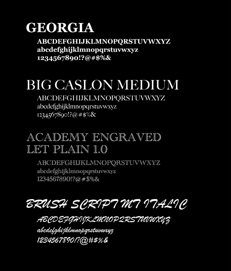
Me and the client had agreed on a design that had incorporated the classic barbershop scissors with a comb replacing the left blade and brush script font circling them to evoke the feeling of the 1950’s-60’s, while adding the big P above it all to resemble how the store has stayed in business into the 21st-century, bringing in customers old and new.


