O'Neil & Co. Logo & Branding Guide
Client: O’Neil & Co. Storage Solutions
Industry: Personal Storage
Year: 2022
Type of Project: Logo design with full branding guide
About This Project: For a rather sharp-edged design, O’neil & Co. was one of my favorite projects to work on, honestly because I have a soft spot for sleek designs with an industrial bend to them (which should explain my own logo).
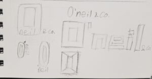
For the storage space industry, I noticed many companies (i.e. CubeSmart, Extra Space Storage, etc.) used modern typefaces with energetic colors in the background like bright greens and reds for their branding. Funnily enough, I was also inspired by truck rental companies like Penske, and everyone’s favorite furniture store, Ikea, mainly because their logos and the branding that went along with them, the usage of blocky typography with smooth edges in some areas felt made for companies that handle furniture, electronics, and other objects that would most likely go into a storage space or be taken when moving into a new home.


