Type of Project: Logo design with full branding guide
About This Project: Pizza! You know it, you love it (or maybe you’re a burger guy, that’s okay too), you probably even got a place you go to regularly for a slice, and Michael’s is just that for the people of Belmont, MA.
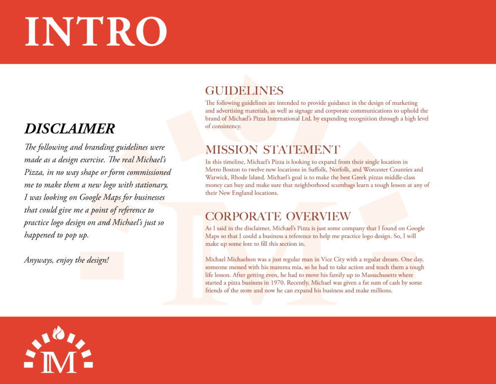
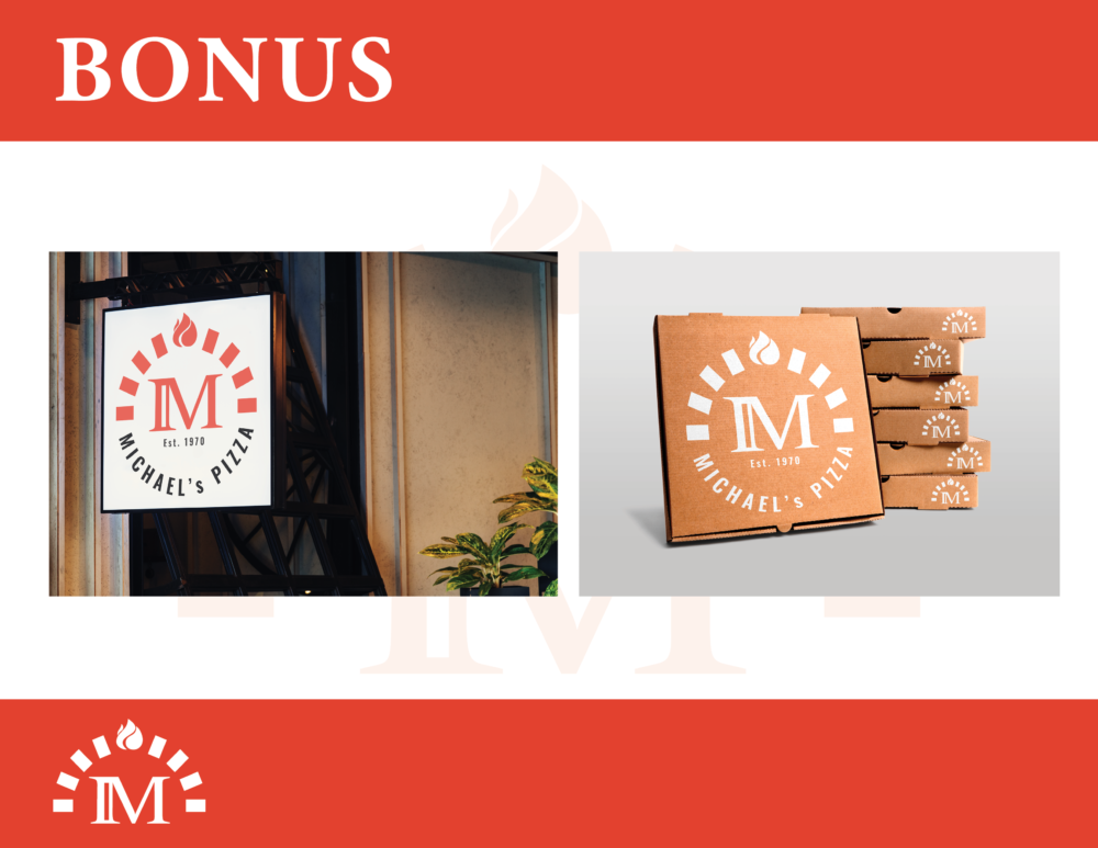
In the branding guide, I mention that this is mock rebranding of some pizza place I found using Google Maps but nonetheless, I needed an excuse to flex my brain muscles. After shuffling through a few ideas with more literal interpretations of the logo that incorporated flames, pizza slices, and an M with a more folded, 3d appearance, I stuck with a simpler, typographic approach.
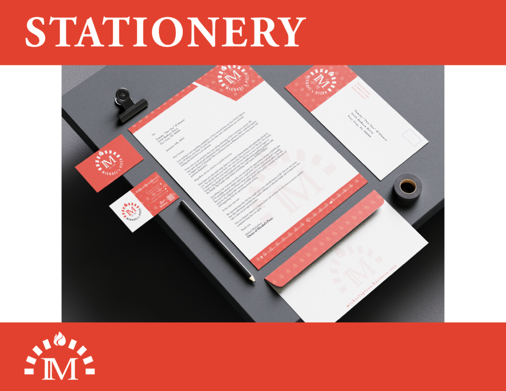
The M in the logo, being modified from the Big Caslon typeface, with Oswald being used for the accent text could help evoke many positive feelings towards Michael’s: elegant, modern, chill, upbeat, and so on. Additionally, the way both typefaces complement themselves allow for the logo to be used with a pizzeria located anywhere, from a local joint in a quiet, residential neighborhood to a downtown shop in a trendy, up-and-coming city.