
Typographic Experiments
Project Name: Typeface Poster Set
Industry: Project For Class
Year: 2023
Type of Project: Typographic Posters
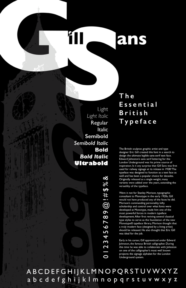
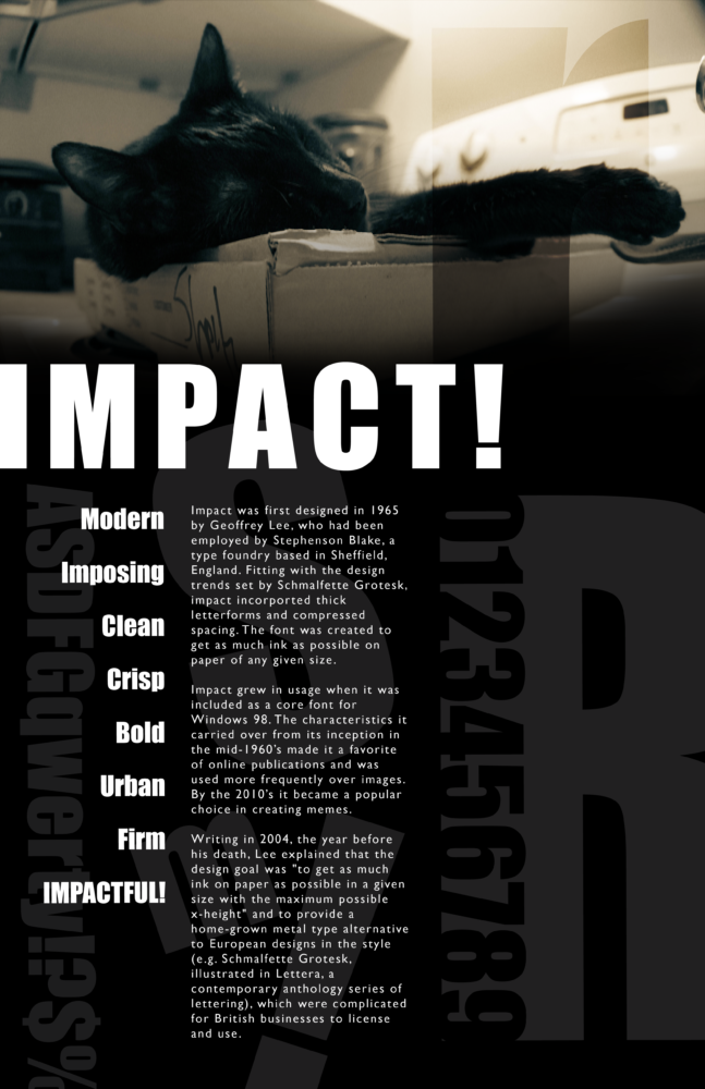
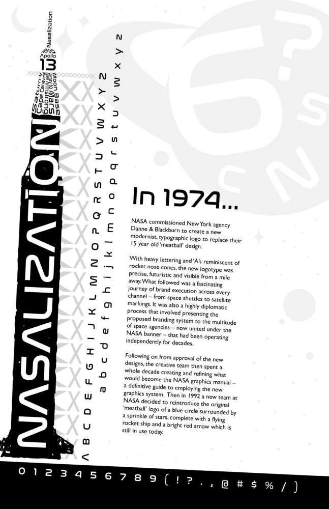
About This Project: Since this was another project for my Design Studio & Practice course at Fitchburg State University, I wanted to go back to some projects from previous classes that I felt could have been improved. Looking back, there was one from my Typography class back in 2021 where we had to make a poster for a typeface of our choice. In my case, I chose Impact. Because I had the time and now, experience, I felt the desire to expand the scope of the project and create a set of three, including Gill Sans, for its versatility, and Nasalization, since it was reminiscent of old graphic design materials from NASA and other government agencies during the 1970’s.
Gill Sans
Impact
Nasalization
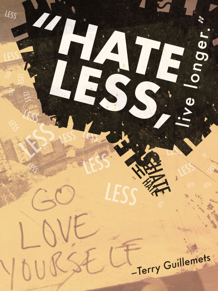
Project Name: Hate Less, Live Longer PSA
Industry: Project For Class
Year: 2021
Type of Project: PSA Poster
About This Project: While studying at Fitchburg State University, one of my assignments in typography class required me to turn one of six quotes into a graphical expression, make it into a creative mental health PSA.
Terry Guillemets’ quote, “Hate less, live longer” proved to contain plenty of potential when working with it in a typographic sense, in fact, the words “hate” and “less” alone made good material for constructing typographic collage in the shape of the speech bubble in the top half of the poster, meant to represent the need for viewers to talk about their struggles with someone they trust and add to our nation’s mental health discussion. Paired with a photo of a sticker I took while I was walking around the Rhode Island School of Design (RISD) campus in Providence, RI with the phrase “Go love yourself” written on it, Guillemets’ quote just fit naturally onto the final composition.
Project Name: Road To Success Visual Quotation
Industry: Project For Class
Year: 2021
Type of Project: Typographic Poster
About This Project: I made this poster back in 2021 for my Typography class at Fitchburg State University.
